Dear allpix team,
I have some trouble interpreting a plot and I was wondering if someone could help me.
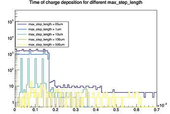
I’m simulating the deposition part in a LGAD sensor and I made this plot for 4 different simulations with different values of max_step_lenght in the DepositionGeant4 module.(here the relevant part of the config file)
[DepositionGeant4]
physics_list = FTFP_BERT_LIV
particle_type = “Pi+”
number_of_particles = 1
source_energy = 120GeV
source_position = 0um 0um -200mm
source_type = “beam”
beam_size = 1mm
beam_direction = 0 0 1
max_step_length = [the values in the plot]
output_plots= 1
To get the information plotted I just took the “type_” leaf in the detector1 branch of the DepositedCharge Tree in the root file given as output by this module and superimposed the histogram for different simulations with different values of max_step_lenght.
Can someone explain what I’m seeing? In particular the step function in the left part of the plot. Does it make sense to even look at this?
Hi @andrea_visibile ,
welcome to the forum!
One thing to clarify: I assume you’re not looking at type_ but at local_time_, can you verify that this is correct? I’ll assume so in my answer.
Most of what you see is totally expected: I assume you have a 50 um thick sensor, meaning that the particles take around 170 femtoseconds to traverse the detector - thus, most charges are deposited within this exact time and almost no charges are deposited after that. For a 10 um step length, the charges are deposited at detector entry and every consecutive 10 um / c = 33 fs, thus the spikes. For step lengths larger that the sensor itself, it’ll be only at the entry, but you see loads of secondary processes and thus a long tail. So also for the 0.5 um step length, you can see a tail on the distribution, which is most likely secondary particles such as delta rays that remain within the detector for a while.
You can also look at the local position in z, this should reflect this behaviour.
Does this make sense and/or answer your question?
Cheers
Paul
Hi Paul,
indeed you are right and I’m plotting local_time_, sorry for the confusion.
Your answer makes sense and fully explain the plot I think, thanks a lot.
Andrea
